北京2022年冬奥会会徽——冬梦
Winter Dream – Emblem of the Olympic Winter Games Beijing 2022
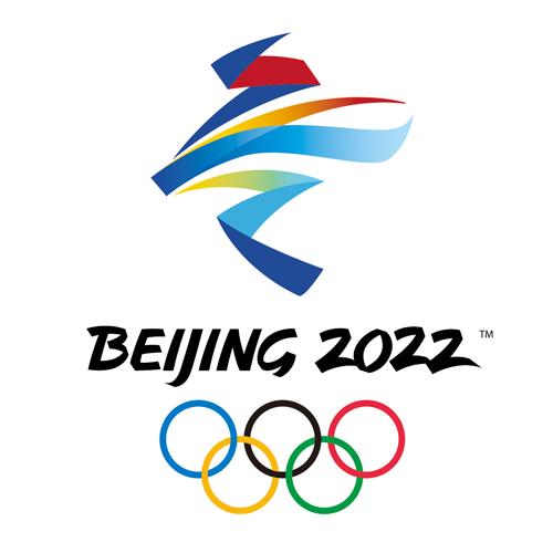
会徽以汉字“冬”为灵感来源,运用中国书法的艺术形态,将厚重的东方文化底蕴与国际化的现代风格融为一体,呈现出新时代的中国新形象、新梦想,传递出新时代中国为办好北京冬奥会,圆冬奥之梦,实现“三亿人参与冰雪运动”目标,圆体育强国之梦,推动世界冰雪运动发展,为国际奥林匹克运动做出新贡献的不懈努力和美好追求。
The inspiration of the emblem design comes from the Chinese character for winter -- “冬”. A stylised, calligraphic rendition of the Chinese character, which infuses Chinese culture with contemporary artistic elements, projects a new image of China in a new era, demonstrating the country's commitment to a successful Winter Games. It also heralds the realisation of China's Winter Olympic Dream, namely, to encourage more Chinese people to take part in winter sports, to build China into a sporting power, and to promote winter sports and the Olympic Movement around the world.
会徽图形上半部分展现滑冰运动员的造型,下半部分表现滑雪运动员的英姿。中间舞动的线条流畅且充满韵律,代表举办地起伏的山峦、赛场、冰雪滑道和节日飘舞的丝带,为会徽增添了节日喜庆的视觉感受,也象征着北京冬奥会将在中国春节期间举行。
The upper part of the emblem resembles a skater and its lower part a skier. The ribbon-like motif in between, full of rhythm, stands for the host country's rolling mountains, Games venues, ski courses and skating tracks. The ribbons, as artistically expressed in the emblem, give a touch of festivity and are an indication that the Games coincide with the celebrations of the Chinese New Year.
会徽以蓝色为主色调,寓意梦想与未来,以及冰雪的明亮纯洁。红黄两色源自中国国旗,代表运动的激情、青春与活力。
The emblem's primary colour of blue represents dreams and the future, as well as the purity of ice and snow. The colours of red and yellow, which draw on those of China's National Flag, represent passion, youth and vigour.
在“BEIJING 2022”字体的形态上汲取了中国书法与剪纸的特点,增强了字体的文化内涵和表现力,也体现了与会徽图形的整体感和统一性。
The presentation of the words “Beijing 2022”, a nod to the art of Chinese calligraphy and paper-cutting, adds to the harmony of the entire emblem.
北京2022年冬残奥会会徽——飞跃
Flying High - Emblem of Beijing 2022 Paralympic Winter Games
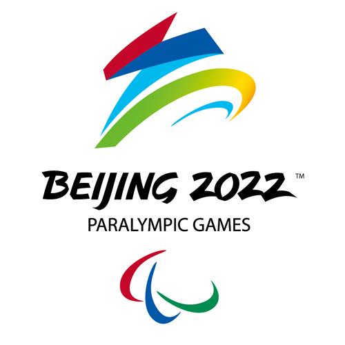
会徽设计秉承展现举办地文化、体现以运动员为中心的理念,将中国书法艺术与冬残奥会体育运动特征结合起来。设计展现了汉字“飞”的动感和力度,巧妙地幻化成一个向前滑行、冲向胜利的运动员,同时形象化地表达了轮椅等冬残奥会特殊运动器械形态。上半部分线条刚劲曲折,下半部分柔美圆润,寓意运动员经过顽强拼搏、历经坎坷最终达到目标获得圆满成功。会徽展现了运动员不断飞跃,超越自我,奋力拼搏,激励世界的冬残奥精神。
The emblem is designed to present the host country's culture and highlight the Games organisers' athlete-centred philosophy. It draws inspiration from the vigour and strength implied in the Chinese character for flying – “飞”, pronounced fei. In a vivid way, the emblem evokes the image of an athlete in a wheelchair rushing towards the finish line and victory. The robust strokes in the upper part and the soft curves below symbolise Para athletes striving for excellence despite their physical disabilities. The emblem embodies the Paralympic spirit that aims to enable Para athletes to achieve sporting excellence and inspire and excite the world.
会徽图形整体充满了昂扬向上之激情,奋进飞跃之动感,色彩丰富,构图完美,象征并激发运动员以坚强的意志作为精神的翅膀,在冬残奥赛场上放飞青春梦想!
With its impressive colour scheme and well-balanced composition, the emblem seeks to convey a message of strength, passion and dynamism. It encourages all athletes to fly high on the wings of their aspirations.

